One day during my sophomore year at Purdue I realized I had made a critical mistake: I had been programming for over a decade up to that point, yet I still didn’t have a website! At the time I didn’t really have much of a brand, so I decided to just throw something together pretty randomly. I looked at one or two sites for inspiration, made a few tiny design tweaks, and settled on some sketches:
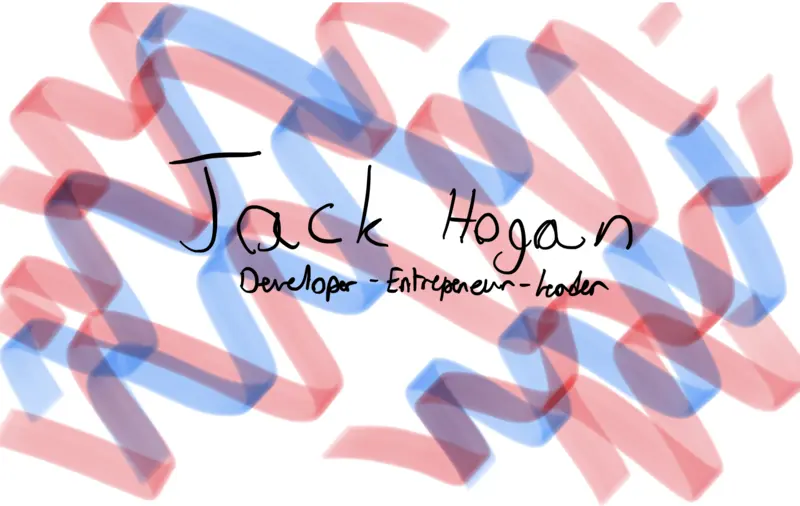
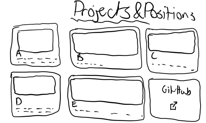
I turned those sketches into this within the span of a few hours:

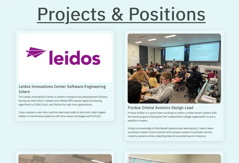
I was proud of myself for making this site, and not without reason. It was my first significant foray into HTML and Svelte that had ended in a real site people could visit. However, I spent very little time doing any verification for responsiveness and basic features such as dark mode, a web standard by that point, were missing for months. Eventually I got around to fixing the most glaring issues (although I never really fixed the mobile experience), but as I fixed more and more problems, I realized I liked my site less and less.
The process of a developer’s personal site becoming less and less appealing over time, what I call “site rot”, is a long process of slowly falling out of love with your creation. There are many causes for it, but the one most relevant to me is I was caring more and more about what my website said about me. My last site gave “used Material UI once, really loves neumorphism, potentially stuck in a time loop in 2020”. Not exactly the impression I wanted to give people visiting my site. The terrible CSS I wrote before I knew Tailwind existed giving people eye strain didn’t help matters. I was also recently invited to the Purdue Hackers Webring, but my site had rotted to the point where even adding one of the three required links was a massive chore.
It was time for something completely new.
I resolved a few weeks ago to start working on a new site over winter break. However, I had very little idea where to start. The only idea I knew I wanted to pursue was multi-column layout and of course I wanted something totally unique. With those two tokens in mind I got to work.
The First Iterations
As shown above, the first thing I like to do when designing any user interface is to sketch it out on my iPad. I started with a basic sketch and came up with my first flare idea, or what would make my website stand out:
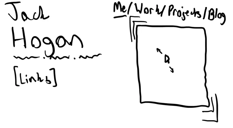
The big concepts to pay attention to here are the two columns, the general size of the text, and the navigation system at the top. These would form the scaffolding of my site and would remain largely unchanged throughout my development process. My flare idea was to create a hover effect where mousing over certain elements would cause little 90° corner edges to expand out from the element’s border, changing ever so slightly in position to follow the mouse. It would’ve looked something like a parallax effect.
I was pretty happy with this and started working on implementing it. I decided to go with Astro (and Svelte) for my site due to its high performance and very nice set of APIs and components. By the way, the entire site is open source! I built out most of the infrastructure pretty easily (although forcing the left column to stay sticky while scrolling required some pretty gross positioning hacks), however I soon ran into roadblocks with regards to how I would get the flaring to work properly. After some consideration I decided to drop it and find a new flare for my site.
Finding My Brand
I thought for a few hours, then eventually came up with the idea of dots. I still wanted mouse movement to be a part of my flare, partially inspired by libraries like particle.js. I wanted the dots to remain static for the most part, so I decided to rely on the size and color of each dot to convey interactivity.
My first attempt boiled down to the following code:
<script>
  function createSvg() {
    let svg = document.querySelector(".dots") as HTMLElement;

    const content = document.getElementById("root-content");
    if (!content) {
      console.error("Unable to find root-content! Dot grid creation failed.");
      return;
    }
    const width = content.scrollWidth;
    const height = content.scrollHeight;

    // Snip

    // Iterate over potential dot locations
    // If there's a selector with that name, check if it's in bounds
    // If it is, do nothing. If it isn't, remove it.
    // If there isn't a selector with that name, create one
    for (
      let x = DOT_SPACING;
      x < width - 2 * BASE_DOT_RADIUS;
      x += DOT_SPACING
    ) {
      for (
        let y = DOT_SPACING;
        y < height - 2 * BASE_DOT_RADIUS;
        y += DOT_SPACING
      ) {
        // Create dot if it doesn't already exist (snipped)
      }
    }
  }

  const MOUSE_RADIUS: number = 100;
  let mouseFrame: number | null = null;

  function mouseFollow(e: MouseEvent) {
    if (mouseFrame) return;

    mouseFrame = requestAnimationFrame(() => {
      // Snip

      // Iterate through dots and calculate distance
      const dots = svg.querySelectorAll("circle");
      dots.forEach((dot) => {
        const cx = parseFloat(dot.getAttribute("cx") || "0");
        const cy = parseFloat(dot.getAttribute("cy") || "0");

        const dx = mouseX - cx;
        const dy = mouseY - cy;
        const distance = Math.sqrt(dx * dx + dy * dy);

        if (distance < MOUSE_RADIUS) {
          // Calculate brightness based on distance (closer = brighter) (snipped)
        } else {
          // Fill with black (snipped)
        }
      });
      mouseFrame = null;
    });
  }
</script>

<svg class="dots"></svg>
When I ran this code performance was less than optimal. I had a suspicion using an SVG was not the best way of doing it, which was confirmed when I got this message from my shader wizard friend Hazel:

She soon told me what I dreaded hearing: I would need to learn WebGL.
Interlude: WebGL
After taking a short break I thought I’d check with ChatGPT could do with making WebGL programs. Turns out, quite a lot! It gave me a program that was about 80% complete out of the gate.
The first issue I had to solve was the color space. I had defined my theme color and its dependents in OKLCH, a new color space that’s been gaining popularity recently. It worked very well for what I wanted and looked great when I wrote the flare as an SVG-based routine, but GLSL has no support for it. Thankfully Hazel offered to translate some OKLCH to RGB routines from JavaScript to GLSL. I was very thankful for her help, and once I added the code to my shader the colors looked great.
After dealing with that I was able to complete the mouse-based effect. Now the dot size and color tracked the mouse cursor!
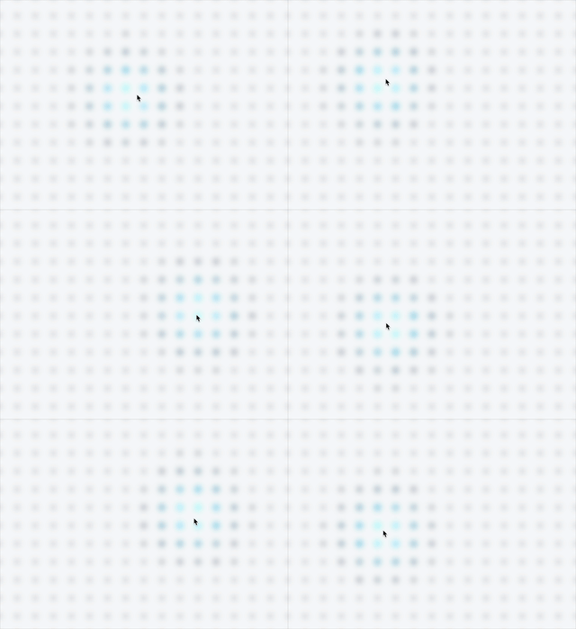
I was happy with this, but it didn’t fully recreate the original flare’s interaction with elements, for example blog post links. By this point my design language had evolved past cards, but I still wanted to include something similar. In the end I went with a system where all of the dots behind an element could light up and grow a bit bigger. However, I had reached the end of ChatGPT’s knowledge and would have to continue mostly on my own.
I started with defining a vec4 for the box coordinates and a float for the brightness of the box since I would need to animate the box brightness manually. I then had to figure out a way to check if there was a box to highlight without using any conditionals. Conditionals can greatly slow down shaders due to the diverging wavefront of processing they can cause. I avoided this by utilizing techniques like using the step function to determine if a point was in the box (something ChatGPT helped with):
float pointIsInBox(vec2 point, vec4 box) {
    vec2 withinBounds = step(box.xy, point) * step(point, box.zw);
    return withinBounds.x * withinBounds.y;
}
This worked quite well, and while I had to write some ugly expressions to mesh everything together, it worked! Now when hovering over any block with the class dot-control the dots behind it would animate to about 75% brightness compared to the mouse! This made the effect visible while still putting priority on the mouse.

Filling In the Blanks
With the flare out of the way I started working on the responsiveness of the site, ensuring I didn’t repeat the mistakes of the past. Thankfully with Tailwind it was a breeze. There were some annoyances, especially when dealing with mobile layouts, but overall it was smooth sailing. Within a few hours I had a perfectly responsive site that worked on any display.
Once that was done I worked on the actual content of the site, arguably the most boring part. I had to thing of good copy that would show who I was while also beings short enough that people wouldn’t start to skip stuff. Once all of the static content was in place I started working on dynamic content. After looking at my friend Ray’s site and its corresponding source I realized my work listings could be dynamically generated from markdown files. It was my first experience using Astro’s content layer and it worked perfectly. After injecting some custom components it looked exactly how I wanted it to and will be easily maintainable into the future.
The work entries gave me valuable experience that helped when working with the more complicated blog system. I decided to base my schema off my friend Ersei’s site, specifically copying their tagging scheme. I automatically generated routes based on all the tags present in all of my blog posts (such as /blog/tag:web for the web tag) then filtered relevant posts on each tag page. All of this is done statically at build time. I’m very happy with how it turned out, especially since other tutorials creating a similar system would’ve forced me to ship JavaScript, something my solution lets me avoid.
Getting the blog’s CSS to look good was very annoying. I based most of my blog post CSS on the Purdue Hackers Blog, a site that I helped translate from NextJS to Astro. However, I still spent multiple hours debugging CSS rules (for the code blocks especially), only to learn that I only needed a w-full tag to make it overflow properly, fixing all of my problems.
The Finishing Touches
After the big items were done I worked on some nice-to-haves my old site lacked. I added an RSS feed for anyone interested in keeping up with my posts. I also added fully dynamic OpenGraph image generation! This required me to add React to my site to use Satori, but since I don’t ship any React on my actual site I’m fine with including it. Some optimizations include using Fontsource to reduce font transfer sizes, converting my images to WebP and shrinking them down substantially, and special view transition tags to prevent things like the dot canvas flare from unnecessarily reloading.
After all of that I had an amazing looking site and an even more amazing change in network traffic:
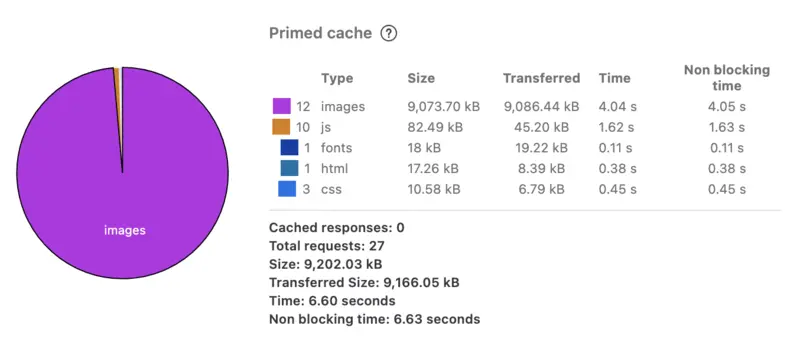
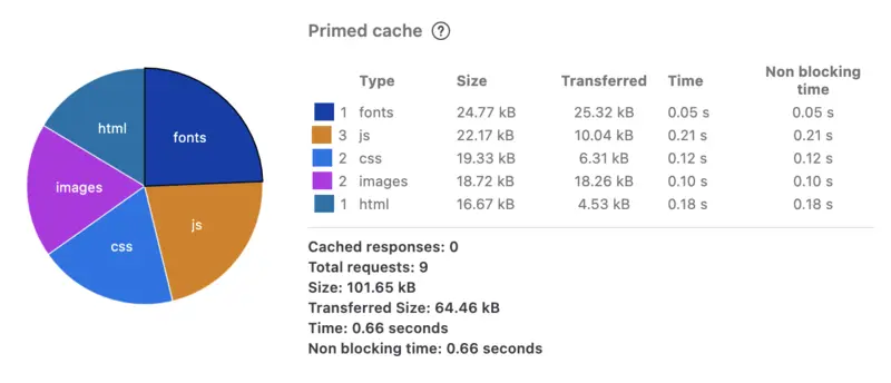
That’s right, I ship about 100 times less data compared to my previous site. Who would’ve guessed that just one year of web development experience would lead to such a drastic improvement?
What’s Next
I’m super happy with how my new site turned out. I don’t know how long I can keep the site rot at bay, but I have a good feeling about my new site’s longevity. I want to expand it to have more pages with little widgets on them (such as the hidden one I use for OpenGraph image generation, see if you can find it!) as well as potentially a microblogging system for short notes; my friend Lachlan has a very comprehensive blogging setup I would love to steal a few things from. In any case, I’m very satisfied with where I am now and I’m excited to work on other projects, ones that will probably show up on this blog in the near future!